

03
User-centered redesign
Peace of mind for stressed sellers
Overview
A new version of our real estate disclosure platform (3.0) had launched, but it wasn’t performing as well as the previous version (2.0). Agents and sellers found 3.0 harder to use, leading to slower adoption and lower engagement. Before a full migration, we needed to refine 3.0 to match and surpass 2.0’s performance, ensuring a seamless transition.
By analyzing user behavior and feedback, I redesigned key workflows, improved usability, and restored features users depended on. The result? A smoother, more intuitive experience that increased adoption, efficiency, and completion rates.
The Problem
Our new version (3.0) was meant to improve the platform, but users were struggling:
Critical workflows were disrupted increasing frustration and time to completion.
Sellers found the new interface confusing. Long load times, lack of feedback, and no way to correct errors lead to frustration and compliance risks.
Completion rates were lower than expected, stalling the migration to 3.0.
Why it Mattered
Agents and sellers rely on our platform to keep transactions legally compliant. Our platform decreases errors and legal risk for our users. For maximum adoption we needed to make 3.0 as efficient as (or better than) 2.0 while preserving its new capabilities. Additionally, supporting two different platforms was costing our company in database fees and development resources.

2.0
3.0

3.1
Approach
To bridge the gap between 2.0 and 3.0, I took a user-centered approach, gathering insights from:
Agent and seller interviews to understand pain points.
Usability testing to compare workflows in 2.0 and 3.0.
Completion rate analysis to identify friction points.
From this research, I focused on three key improvements:
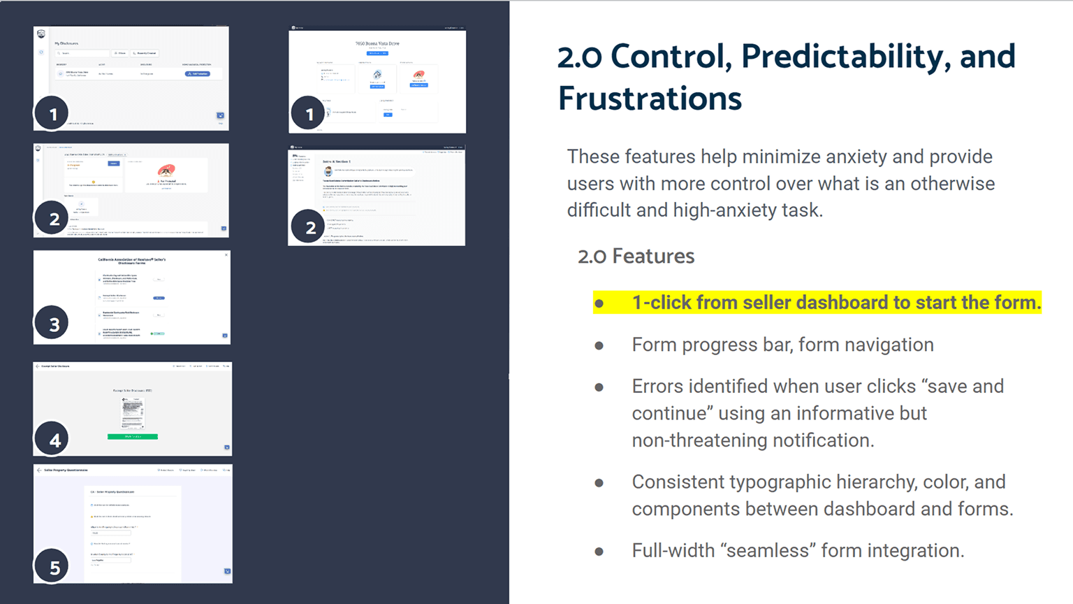
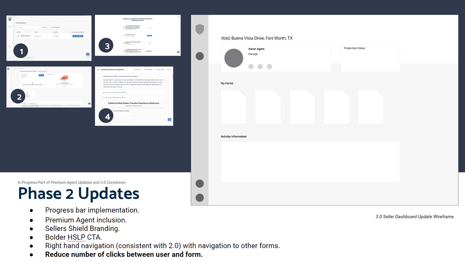
Restoring essential features from 2.0 while keeping 3.0’s new features.
Redesigning UI components to improve clarity, brand cohesiveness, and ease of use.
Optimizing performance and automation to make tasks faster.
-Seller Interview
Notes from audit and update plan

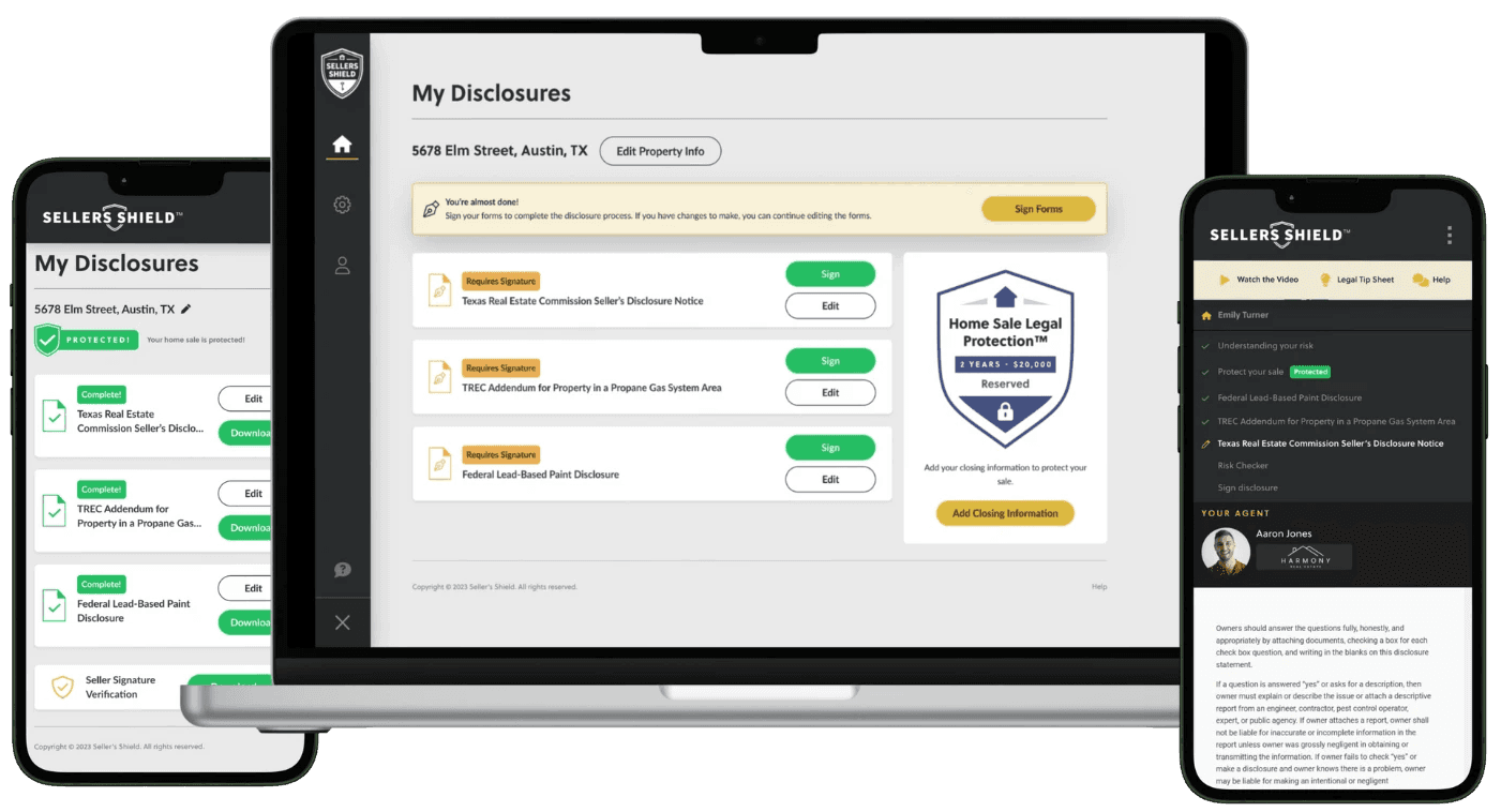
2.0 Dashboard
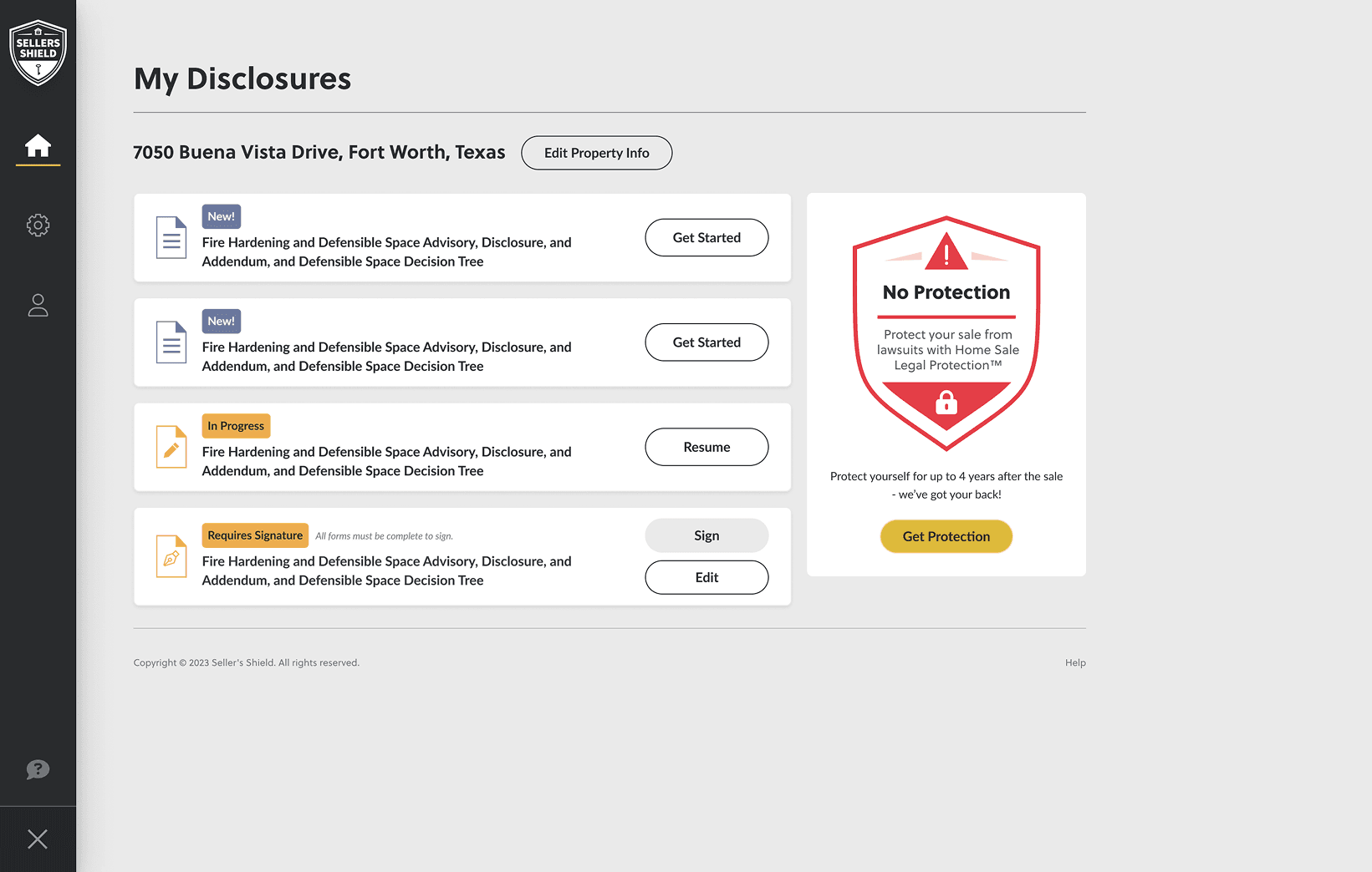
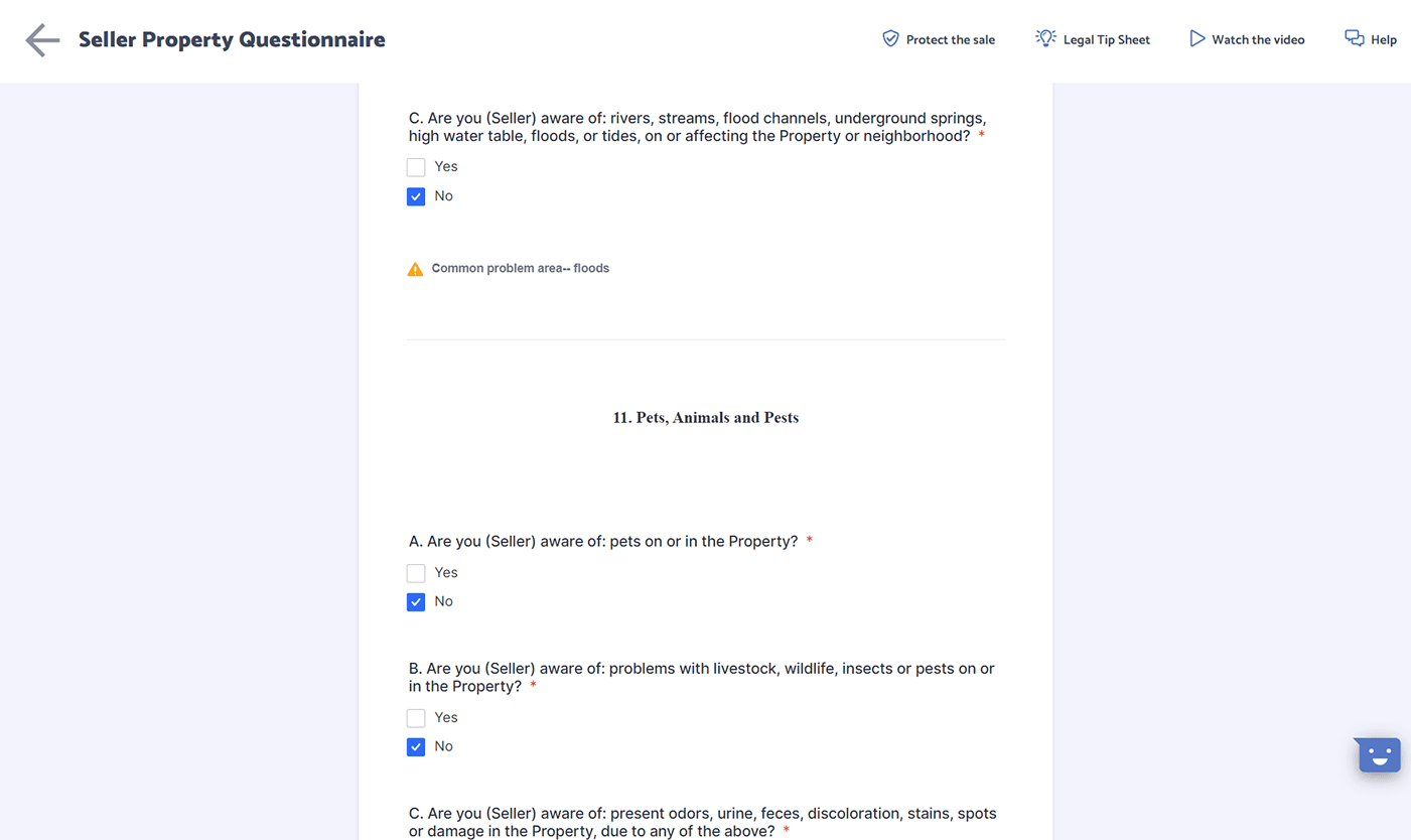
3.1 dASHBOARD


3.1 Mobile Designs
Impact
Matched and then exceeded 2.0’s performance, making full migration possible.
240% faster seller onboarding, reducing friction and time-to-task rates for sellers.
14% relative increase in seller form completion rates, improving efficiency.
Fewer compliance errors, reducing legal risks for agents.
-Agent Review
Reflection and Next Steps
This project reinforced the importance of user attachment to legacy systems—even well-intentioned upgrades can disrupt workflows. By listening to users, we created a familiar yet improved experience, ensuring a smooth transition.
Next, I’d explore:
Adaptive learning features to further optimize agent efficiency.
More automation tools to make transactions even smoother.